Devlog 3 C21741655
Dear potential pilot,
This week we decided to centre most of our efforts in the enemy designs, both visual and gameplay design. The first part of the process to create the enemies was to make gameplay variations. We ended up deciding to create 3 different kinds of enemies one that shoots straight like the character, the second one would shoot in a wave pattern to make it harder for the player to protect against the bullets and finally the third enemy will shoot directly towards the player independently of his position.
After deciding on what the enemies should do in game we had to decide how it was going to look. We immediately decided to make it look more like a biological creature rather than a machine to help the player identify them as enemies more easily. With these 2 decisions in mid we ended up deciding them to look like space dragons that have some inspiration from parasites.
After deciding the design of the enemies we also had to decide how the player would differentiate the different variations from the others. We had two options, we either made some small variations in the main design or change their colour, we ended up choosing to change the colour. The first three colours we chose to make the variations were red blue and yellow, but after they were fully coloured we decided to change the yellow colour for green, this decision was made because the yellow colour was t0o distracting compared to the others. The final decision was to give the straight shot to the red one, the wave pattern to the green one and the homing bullets to the blue one.
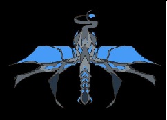
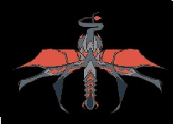
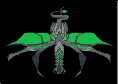
The las thing we decided to do for the enemies was to come into the screen in set waves and not at random.
Some more advancements we made this week was to finally create a proper sprite for the health of the players. We decided to go with the classic set of hearts that disappear after getting hit rather than a life bar. This decision was made to simplify more the gameplay because now the player knows that every single shot will deal the same amount of damage.
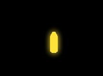
The final part we added this week was a proper sprite for the bullets instead of using simple pixels or rows of them. We decided to give them a distinct glow and a bullet shape.

Right now we are having a couple of issues with the game, the most notable one is that the itch.io version does not run on WebGL and at the moment we are trying to fix it. In the worst case scenario, we would decide to make it exclusively a downloadable version for Windows. Another problem we are facing is that the kill zone isn’t working as intended, but that will most likely be fixed next week.
For next week we intend to have a proper background for the game, the main tutorial to teach the players and three levels completed.
Stay tuned!
- Group 6.
Meteor
| Status | In development |
| Authors | Aethercorp, Mickname, ColmOS28, Korn |
| Genre | Action |
| Tags | Space, Top down shooter |
More posts
- Dev Log Week 4May 17, 2022
- Develop Week 2May 17, 2022
- Dev Log 1May 17, 2022